Saturday, April 26, 2008

Flower Photography Tips


The above photos were all done by my students. These are the techniques I require them to try:

1. Flower photography is very much like portrait photography. Be aware of the effect of lighting and shadows. You can use the spot healing tool the same way you would for a portrait, if you are looking for perfection.

2. Try holding a stiff black background (like black presentation board, or black foam core board) behind the flower, even with natural lighting.

3. Drops of rain or dew are magical on a flower, but a spray bottle of water can be used if you don't feel like getting up in time for the dew.

4. Get to know your macro...but don't always use it. Understand depth of field and use both shallow and deep.

5. The most convenient angle is also probably the most boring.

This lesson and other Advanced Photography lessons (lessons for the second semester) are on my Teachers Pay Teachers site.

Tuesday, April 15, 2008

Rich Learning on the Web

http://webexhibits.org is a very art-student friendly collection of educational web galleries. (As a matter of fact, it was a student who showed me the site.) It is a collaboration with IDEA (see below) and museums worldwide, including the National Gallery of Art. Some of the chapters are: Color Vision and Art (with several interactive activities); Pigments through the Ages and Van Gogh's letters.

http://idea.org is the site from which the above site originated. Here are a few paragraphs from their intro: "The Institute for Dynamic Educational Advancement (IDEA) is a nonprofit organization that takes bold ideas about facilitating and broadening the learning process and transforms them into information systems that are then shared with others who share our passion for interactive learning.

IDEA arose out of the belief that there should be no barriers between people and computers. Technology is now advanced enough to adapt to the ways people naturally think and interact with the world. The user’s experience with technology should be personalized, interactive, and intuitive, so that the tools add breadth and depth to the information presented, and stimulate creative thought. Innovative strategies built into the technology can help people from all walks of life maximize their potential."

Big goals. Although the IDEA site is designed to help people who are designing educational websites, parts of it are useful to all educators, from some theories of learning to effective evaluation of your own work, to a color blindness simulator. If you are trying to create an educational interactive website, this is a resource you shouldn't pass over.

Hopefully both these sites will continue growing.

Wednesday, April 2, 2008

Teens Take Over the Commercial Photography World


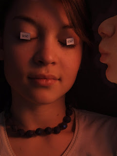
The commercial photography industry should just hire our students. I just brought in some low-end studio lights (all I had were two) and some black fabric for our backdrop. All I did was demonstrate the effects of aiming the lights different ways, tell them to use a tripod, suggested the occasional tissue paper filter and showed them how to use the reflector. They took to the job like pros, bossing each other around. "OK, look sad...no like your sister just died...no, like you're a drug addict whose whole family died... Great. OK, now, flirt with the camera..." Where are they learning this stuff? Must be a reality show. They even put on airs and talked with accents.

Here are just a few student examples. If you want to buy some studio lights and backdrop holder, look at websites like BHphoto, or maybe ebay. You don't need the expensive stuff, just the basic: lights with soft light filter, backdrop holder and a reflector is nice (or you can make one out of aluminum foil). Does anyone else have any studio style shots to share with us?

My lesson plan for this project and other Advanced Photography projects are on my Teachers Pay Teachers site.