
We all know the generalizations about Digital Natives: they read more lines of text messages than they do lines from books, they spend more time on Facebook than with their face in a book, they need a constant stream of music to be productive, etc. But, what are your actual observations? I would love to hear from those of you who have a lot of time to observe digital natives.
These are my observations: Digital Natives are not really that impressed with digital art like we were when Photoshop hit the streets. It's fun to make, but they are more in awe with art a mano. After all, they have always had a world of Photoshop art, it's almost 20 years old now. Art by hand seems more of a challenge to them, and highly individual, to many of them, frightenly foreign. Following the lead of the professional graphics world, I create projects for my computer graphics II students that incorporate their drawings. The design world now demands the surprise and individuality of handwork. We can't cheat our students of that experience. My computer graphics students who have taken one or more 2D class have no problem with incorporating one of the scanned drawings into a final digital design, but those that haven't freeze up.
Videos as non-art class projects are so common now that some of my students had 3 videos due in one week for 3 different subjects.
Have you noticed all the handlettering in posters and ads and even commercials that target those under 30? Take a look at these awsome hand-lettered restaurant chalk-boards. Art schools still require some handwork in typography classes.
Most digital natives who are musicians don't make music alone on a synthesizer or with Garage Band. They crave a band and an instrument. Of course, they will always promote their music with posters, videos, myspace, pure volume, etc. And, they will lay down tracks with their recording software. Technology is a convenience that won't disappear.
How do digital native poets get attention now? Sure, thanks to technology they can self-publish with affordable on-demand book publishers, and they can put their work online. But poetry slams are like the pre-technology beatnik poet coffee house readings. In my town, I'm trying to find a space for a young poet to write his poetry on the wall of a gallery with illustrations by his buddy accompanying it. Writing on the wall. Why hasn't graffiti art fizzled out with computers? Just search "wall art" and "murals" on vimeo or youtube.
Art a mano. It must be something primitive that we won't ever let go of, that is, until our opposable tumbs disappear. Of course, we wouldn't be able to see it all without the internet...
My son who is majoring in graphic design (communication arts, actually) just had his 21st birthday. Guess what he asked for. Art supplies, canvases, brushes, paint. Yea, we gave him a wacom tablet, which he didn't ask for, but guess what he is most excited about. He's got a head full of painting ideas and is begging me to let him make art on some of our home's white walls.
He's a fan of the artist blu . That's the subject of another blog.
Thursday, November 27, 2008
Friday, November 21, 2008
Course Content Materials for Everyone
MIT OpenCourseWare is an initiative of the Massachusetts Institute of Technology to put all of the educational materials from its undergrad and grad-level courses online, free and available to anyone, anywhere.
Check out this list of 100+ Courseware Links for Artists from artcareer.net.
Check out this list of 100+ Courseware Links for Artists from artcareer.net.
Monday, November 17, 2008
We Love Posters
In Graphic Design classes, poster projects are the fudge brownie sundaes of projects. The history of poster design shows that in the effort to be eye-catching creativity is given free range. Lettering can be hand-drawn, composition could include mismatched cutouts. Doodles and tape and the bizarre are welcome.
But we all have students who freeze when given such a chance to show their creativity. I have recently purchased 2 fantastic poster books that I prefer to keep by my bed so I can look at them every night, but my intention is to take them to school for my students.
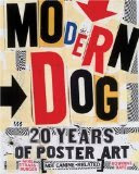
Modern Dog: 20 Years of Poster Art (Not Canine-Related) is a collection from the Seattle group of cutting-edge poster radicals/comedians. Check out their website.
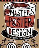
Masters of Poster Design includes their peers, 256 pages of eye-candy and a book jacket great enough to frame.
Sunday, November 16, 2008
Yes Virginia, There is a Santa Claus
Remember those CG 3D modeled fantasy landscapes that blew us all away about... a decade or more ago? The Bryce software used to create them is now FREE. Yes, legally FREE. It is not the latest version, but if you have been wanting to introduce your CG students to 3D animation software, this is a good gateway. You create a "wire mesh" frame, put a skin on it, control the lighting and see it in multiple directions, and even give it simple movement. It is easy to make your own landscape and 3D objects, after you spend time figuring out how it works.
The only drawback is the slow rendering time, so you need to plan how to render overnight, maybe encouraging the students to download the free version at home as well and using a flash drive, take their work home to render.
You need to go to the DAZ 3d website first, go to support, create an account and request your free serial number. Then you can download it for free at downloads.com
Check out the demo reel .
The. Lens: A Network for Student Photogrpahers
Check out David Gran's latest great idea, a ning for student photographers: http://studentphoto.ning.com/
The photos are excellent and an inspiration to any photography student. They can create a profile, upload their photos, create a slideshow of their photos, leave comments and start discussions and read the blog. Nothing new for them, right? The pool of participants are international. If you are my age, the closest we got to such excitement were those handwritten letters we got back from our foreign pen pal a few times a year.
One especially interesting blog entry by Paddy N is about Graffiti Research Lab
Thanks again David.
Sunday, August 31, 2008
Burst Mode Photography as An Art Form - Virtual Flip Books
Check out this wonderful presentation of Burst Mode (a.k.a Continuous Shooting Mode) photos on Mediastorm.org. (There is a little gore in the middle.) Is it flip-book animation? stop-motion animation? a category all it's own? I've decided to turn this into a project with my Photography II students. They will put their images in iMovie and add music. I will put all the individual movies into one longer one for our art show. I figure when my students are done, they will really understand the burst mode.
Sunday, August 3, 2008
What are you waiting for?
If you haven't subscribed to lynda.com...what are you waiting for?
Do you need high-quality video tutorials to help you learn new software, anything from Photoshop to complex animation software? Do you need videos to share with your classes, say an interview with Milton Glaser, or interview with Pentagram that gives a taste of how designers think? Are you confused about how a digital camera works? How about 16 separate videos to show your students that give an inside look into one of the most innovative web design firms and how they work, including how they work with clients? This site is so deep and wide you will not tire of it. And the beauty of it is that even though you have to pay a subscription fee (about $25/month last I checked) you are not committed to more than one month. My family however started our subscription about 2 years ago and haven't stopped. (I'm married to an animator, my oldest son is studying graphic design in college, and my younger son is a Photoshop and photography wiz.) Everytime I start exploring it, I see that they have a wonderful new addition. I found exactly what I need as an introductory video for my graphic design class (Big Spaceship) and they just added it 2 days ago. Subscribing to lynda.com costs a lot more than subscribing to most magazines, but it is so much more useful (and there are no ads).
No, they aren't paying me to write this blog entry... but they should!
Tuesday, July 29, 2008
Landscape Photography While the Weather is Good

Landscape photography is very challenging. It is hard to compose well, because there are so many shapes. You can't move the subjects, well maybe a stick or small rock, but certainly not a telephone pole. And if you expose for the sky you have land that is probably too dark. On top of that if you don't choose the right time of day the colors can be very boring and you might have glare. You have to be at the right place at the right time and this might mean returning later or hanging out for a few more hours.
Here are some tips I've learned, some you'll recognize from landscape painting.
1. Compose and balance the large value shapes.
2. Look for interesting lines, especially those leading into the composition for a sense of depth, and those pointing to the center of interest.
3. Speaking of lines, make sure your horizon is straight, unless you are making a dramatic diagonal. A slight diagonal looks like a mistake. You can always fix this in Photoshop.
4. What is creating the depth? Converging lines, diminishing scale and/or atmospheric perspective? In other words, if you want more depth look for those.
4. Ideally, you should have an expensive SLR and a graduated neutral density filter so that you can balance the exposure of sky and land. But, if you don't, put your camera on a tripod. Bracket above and below and then in Photoshop using the automated Merge to HDR (high density resolution) to get the best of both. Or, if you really have no other choice expose for the sky and in Photoshop use a mask to change the levels of the land and hope that you don't have much noise.
5. Be aware of the color quality and shadow and light direction that depends on the time of day so you can plan your shot. If the light isn't great right now, what about in a few hours.
6. One third sky or land, two-thirds the other is a good rule of thumb, unless there is an advantage to half and half, like using symmetry to create calm. Center of interest should not be in the center, usually.
7. Consider including the foreground.
8. Study the weather channel. Would a sky full of clouds be better than a solid blue sky? Do you need to return another time to get the right sky?
Example above: I think I composed the lines and shapes well. The time of day was perfect and I have one small area lit up and atmospheric perspective. I even have some foreground and an interesting sky. The problem was this was an unexpected view on our way home and we were on a one-lane bridge. I yelled "STOP!!!" to my husband who was driving and grabbed my camera. However, the person coming in the other direction beeped their horn at us! (Can't someone just take a photo on a summer evening in the middle of nowhere? Where did he have to go in such a hurry in the middle of a national forest?) So, I didn't have time to put on the right filter on or bracket or change my position to get the tree clump out of the center. I had to use Photoshop and masking to fix the dark land. As a result it looks like the slightly unreal colors of a Maxfield Parrish illustration. I'm definitely going back there to get a much better photo... as soon as I save up the gas money.
You can find some fantastic examples on photo.net Choose the Landscape category from the dropdown menu.
Photography Project Ideas
Digital-Photography-School.com has a forum where folks propose assignment ideas, like "Ghetto Lighting" (using everyday lighting like a desk lamp or flashlight), minimalism, eyes, rivers, shadows, self portraits, feet, etc.
At the end of a school year I asked students to type me a little note about what they liked/didn't like about the class. I only had handful of students take the time to do so. One said there were too many projects to complete, and another said she wished I had more assignments because when she finished early she was bored. So, I think I'll make a folder of extra lesson ideas for "If you Finish Early"... or something like that. I'll get some of the ideas from this website.
One of the assignments was "From the Hip". The most exciting one was actually, "Above the Head". I'll think I'll "steal" that idea. It forces students to try different angles and adds some mystery, since you can't see your LCD or viewfinder. Maybe I'll make it one of the steps in an "Overhead Point of View" assignment. Sounds like fun to me.
Also, check out their Digital Photography Tips section with topics like: 10 Ways to Take Stunning Portraits.
What Matters
What Matters to You // Me? from Jr.canest on Vimeo.
This was done by a Vancouver Film School student.
Wednesday, July 23, 2008
Light Painting

Check out this great video that the Carrot Revolution blog posted on Light Painting: drawing with a light source in the dark while you capture it with a slow shutter speed. I'm going to show it to my students, but might have to make it an extra credit assignment because only some of them will have point and shoots with manual or shutter speed settings.
There are many wonderful examples of light painting on flickr. Here's one set, another, and another. When you see all these images you realize that light painting is not just drawing with a light source, but it also includes shining lights, often color lights, on objects, another version of handpainting an image, but in the camera.
The above photo I took this summer when I was in the audience of a black light dance on stage. They were dancing with light, so I switched to a slow shutter speed and captured a light painting. If you try this, let me know and share your examples with us.
Tuesday, July 22, 2008
How to Start a Digital Photography Class
One reader left a comment asking for helpful hints for starting a digital photography and video class.
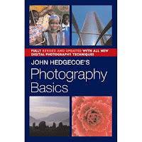
I also had to start the digital photography class for our county and I was feeling lost until I purchased John Hedgecoe's Photography Basics and his New Manual of Photography (mentioned earlier in this blog "Essential Photography Books"). I basically had my students do projects based on finding shapes, line, pattern, texture, light direction etc. as he suggests in his books. He also covers topics, like flowers, portraits, etc. Then I would add project ideas that I would get by reading other books and keeping up with online sites. (I've mentioned several in earlier entries in this blog.) John Hedgecoe also wrote a great book on filmmaking that I had in college, but I haven't checked if it is still in print, or if he has a video version. I only teach one unit on video using iMovie and I mention good video examples for a starting point in an earlier entry.
I think the key is to remember that you are approaching digital photography and video as art instruction. There are so many digital photographers and Photoshop experts who do not have a background in art and you can tell from their writing that they approach it as a technology challenge, not an art challenge. In my blog I try to focus on the ones who approach it as an artist. So, be careful what books you buy and what websites you read. Remember to cover the art elements and principles of design as well as the concept and purpose of expression. I make the technology part secondary, and they learn it as they go, not all at once.
I always start the year with a History of Photography lecture based on http://masters-of-photography.com (the dashes are important because there is another site without them). That site not only has examples but great articles about each photographer explaining their approach and motivation. It helped me remember a lot from college history of photography classes as well (a long time ago). The students love that lecture because they feel like peeping toms to the past. And, of course, if you have to justify that you tie other subjects into your art classes, well, this one is easy since so much of our nation's history is documented in these photos. Since I love history, I ask them to tell me what they know about the subject of the Dust Bowl, the Industrial Revolution, etc. that they see evidence of in the photos.
I try to introduce visual ideas during the lecture. For example, looking at Dorthea Lange, tell her story but also ask questions: "Did she ask her subjects to smile?" "What angle to the subject was she when she took this?" "What would have happened if she had stood 10 feet to the left? The diagonal line would have become horizontal and that is no where near as interesting." etc. This lecture is important because it helps make the students more comfortable with what I am expecting, before they ever have to turn in a project. Before I give them their first assignment, they already have a sense of the big idea of photography as an art form, that it is as much about the composition and lighting as it is about the subject, and that there is a boring way to represent the subject and a more intriguing way. It helps them understand the difference between snapshots and photography as an art form.
I highly recommend buying the two Hedgecoe books . They made my life a lot easier when I was asked to write the digital photography curriculum and my last photography class had been in the 70s.
Also, my first digital photography shooting projects of the year are: Photographing a Subject from Several Angles, and Shadows as the Subject (this one helps them think abstractly about big shapes instead of the subject). When school starts up again, I will show student examples of these early projects.
I have a collection of some beginning Photography lessons and advice for organizing the class on my Teachers Pay Teachers site. (This is the link to the first set, there are several others as well.)
Thursday, June 26, 2008
Photography Scholarship to NANPA Summmit
The North American Nature Photography Association gives student scholarships to their conference every year. It includes workshops in the classroom and in the field as well as critiques. It does not cover airfare, or food and supplies ($300). The applications are due October 6, 2008 for the February Summitt in Albuquerque.
Tuesday, June 24, 2008
Website for Design Lesson Ideas
If you teach graphic design, spend some time with this educational resource website provided by Cooper-Hewitt National Design Museum. The lesson plans are well-developed and easy to search. Of course, design goes beyond graphic design. I found a great project idea for a 3D class I will teach next year.
Tuesday, May 20, 2008
Ansel Adams
Adams is an inspiration not just because of his photographs, but also his zest for life with no boundaries. You understand what I mean if you've read his autobiography. Don't miss this NY Times web article with sound byte interviews about him. This is another website with sound from the San Francisco Museum of Modern Art. PBS has a movie about him as well.
Really, next time you need some inspiration to do anything, read his autobiography. When you finally put it down you will feel like you can accomplish anything. You probably won't want to put it down until you reach the end, but it is not very thick, so it makes a great weekend retreat.
Really, next time you need some inspiration to do anything, read his autobiography. When you finally put it down you will feel like you can accomplish anything. You probably won't want to put it down until you reach the end, but it is not very thick, so it makes a great weekend retreat.
Tuesday, May 6, 2008
Focal Press Book: Black and White in Photoshop CS3 and Photoshop Lightroom
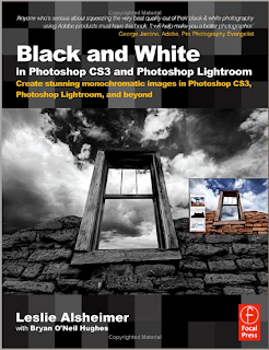
This is now on my list of highly recommended books for digital photography educators. Leslie Alsheimer has a wonderful, comforting, sometimes lighthearted tone to her writing. Her ability to communicate shows that she is an experienced teacher. She teaches digital photography workshops in Santa Fe. And she is a very inspiring photographer as well. She obviously took great care in preparing every chapter and choosing every photo. This is a book by an artist, not just someone who has expensive equipment and likes to take photos and work in Photoshop.
I have not only improved the quality of my own photography after reading this book, but I find myself remembering many of her tips when the time comes to approach a subject with my students. If you are an intermediate to advanced user of Photoshop, you will still find new ideas here. I especially appreciate that she starts right off by discussing workflow instead of making it an afterthought.
I had trouble putting the book down. And when I was done, I realized I had learned as much about color digital photography as black and white. You don't necessarily need the CS3 version to use this information, and Lightroom is a small part of the process.
By the way, I love Lightroom. How in the world did I manage all my photos before?
Dance Photography, Movement Fashion Photography, and Boxing
We just finished action photography. Wish I had remembered this short video on Adobe's website beforehand. The photographer, Sarah Silver explains how she takes photos for Dance Spirit magazine and movement fashion shots.
Also on that page is a link to Sye Williams and his photography of boxers, show dogs and miscellaneous oddities of the south.
Also on that page is a link to Sye Williams and his photography of boxers, show dogs and miscellaneous oddities of the south.
Baz Luhrmann, Apple, a Design Contest and Podcasts
If you get Apple email (and actually open it) you may already be aware of this: The Set to Screen Series: Be part of a new adventure in filmmaking.
The podcasts show wonderful examples of yet another way artists are important professionals. I plan on showing them to my computer graphics students on a day when they just can't focus on work.
Student contests (high school and college) accompany each podcast. The first is making a poster from photos provided from Baz's movie Australia. (due May 26) Your students must create it on a Mac.
I hope that when my son enters and wins he includes me on the trip for 2 to Australia grand prize.
Saturday, April 26, 2008
Flower Photography Tips


The above photos were all done by my students. These are the techniques I require them to try:
1. Flower photography is very much like portrait photography. Be aware of the effect of lighting and shadows. You can use the spot healing tool the same way you would for a portrait, if you are looking for perfection.
2. Try holding a stiff black background (like black presentation board, or black foam core board) behind the flower, even with natural lighting.
3. Drops of rain or dew are magical on a flower, but a spray bottle of water can be used if you don't feel like getting up in time for the dew.
4. Get to know your macro...but don't always use it. Understand depth of field and use both shallow and deep.
5. The most convenient angle is also probably the most boring.
This lesson and other Advanced Photography lessons (lessons for the second semester) are on my Teachers Pay Teachers site.
Tuesday, April 15, 2008
Rich Learning on the Web
http://webexhibits.org is a very art-student friendly collection of educational web galleries. (As a matter of fact, it was a student who showed me the site.) It is a collaboration with IDEA (see below) and museums worldwide, including the National Gallery of Art. Some of the chapters are: Color Vision and Art (with several interactive activities); Pigments through the Ages and Van Gogh's letters.
http://idea.org is the site from which the above site originated. Here are a few paragraphs from their intro: "The Institute for Dynamic Educational Advancement (IDEA) is a nonprofit organization that takes bold ideas about facilitating and broadening the learning process and transforms them into information systems that are then shared with others who share our passion for interactive learning.
IDEA arose out of the belief that there should be no barriers between people and computers. Technology is now advanced enough to adapt to the ways people naturally think and interact with the world. The user’s experience with technology should be personalized, interactive, and intuitive, so that the tools add breadth and depth to the information presented, and stimulate creative thought. Innovative strategies built into the technology can help people from all walks of life maximize their potential."
Big goals. Although the IDEA site is designed to help people who are designing educational websites, parts of it are useful to all educators, from some theories of learning to effective evaluation of your own work, to a color blindness simulator. If you are trying to create an educational interactive website, this is a resource you shouldn't pass over.
Hopefully both these sites will continue growing.
Wednesday, April 2, 2008
Teens Take Over the Commercial Photography World


The commercial photography industry should just hire our students. I just brought in some low-end studio lights (all I had were two) and some black fabric for our backdrop. All I did was demonstrate the effects of aiming the lights different ways, tell them to use a tripod, suggested the occasional tissue paper filter and showed them how to use the reflector. They took to the job like pros, bossing each other around. "OK, look sad...no like your sister just died...no, like you're a drug addict whose whole family died... Great. OK, now, flirt with the camera..." Where are they learning this stuff? Must be a reality show. They even put on airs and talked with accents.
Here are just a few student examples. If you want to buy some studio lights and backdrop holder, look at websites like BHphoto, or maybe ebay. You don't need the expensive stuff, just the basic: lights with soft light filter, backdrop holder and a reflector is nice (or you can make one out of aluminum foil). Does anyone else have any studio style shots to share with us?
My lesson plan for this project and other Advanced Photography projects are on my Teachers Pay Teachers site.
Monday, March 31, 2008
Essential Photography Books

When I was first given the opportunity to teach digital photography, I had to head to the bookstore. My last college photography class had been 1979. I had taken 3 levels of photography and had worked as a photojournalist in my mid-20s, but remembering how I was taught the essentials was packed away somewhere in the attic section of my brain.
My digital photography curriculum is a combination of photography essentials (composition, lighting, point-of-view, expression, topics) and Photoshop. During the warm weather months we focus on those photography topics (which would apply to film as well) and then, obviously, during the months with nasty weather, we focus on Photoshop and studio photography. And, as you probably have discovered, there are no books that I have run across that cover both topics well, which is understandable. And for that reason, I do not use a text book.
The majority of the photography part of the curriculum came from two fantastic books, John Hedgecoe: The New Manual of Photography: A Definitive Guide to Photography in Every Format, and his more basic one, John Hedgecoe's Photography Basics. I recommend both, because you can use a lot of the chapters from his Basics directly in the classroom. The Definitive Guide takes more careful thought about what is too advanced or non-essential for your students. I remembered him from college. I loved his book on filmmaking. He writes so beautifully and from the perspective of an artist, not a tech geek. And, they are visually exciting books, as well.
Here are just a partial list of sub topics in his chapter called, "The Art of Good Photography Composition" (Definitive Guide): The selective eye; placing the subject in the frame; using diagonals; circles; frames within frames; selecting a viewpoint; linear perspective; using shadows; texture, pattern, and quite a few more. He has another complete chapter devoted solely to color.
So, if, like me, it's been a long time since you took that photography class, consider these two books. There are many others that cover more specific or advanced photography topics, but these are the best essentials for the art of photography.
Wednesday, March 26, 2008
New Assignment Got You Scared?
This is the time of year when a lot of art educators, especially in public high schools, are told, "You will be teaching __________ (fill in something you know diddly-squat about)." That's the nature of our job. If parents only knew how unprepared we sometimes are. If you are visiting this blog because you were just told to teach Computer Graphics or Digital Photography or some other form of creative visual communication on the computer for which you have little experience, relax: there is help, very affordable help, with a friendly name: lynda.com. This site has very detailed video tutorials on just about any software you will need to know, as well as great basic information about.
For example, they have about 120 hours of Photoshop CS3 tutorials, broken up into manageable chapters. But they also have 5 hours of Digital Photography principles, from history of photography to composition. They cover about 200 products from Illustrator to Flash to 3D Studio Max to Dreamweaver, even basics like Word, all up to date.
Lynda.com is designed to be very comforting and easy to follow. The individuals who teach each topic are the type of person you'd like to take out to dinner. Nice, friendly folks.
But, here's the beauty of it. This incredible video collection is only about $25/month with no long-term commitment. That means if you only have July to get your act together, you pay $25 and you can spend 10 hours a day with it if you want. You play only the videos you need, you replay them if you need to. Easy.
My husband (an animator and multi-media wizard) and I use it frequently. I have recommended it to several teachers who couldn't afford a local college class (or wanted to move faster than the local class) and they have loved it as much as we do.
So go meet Lynda and relax.
Adobe School Innovation Competition-May 12
From their website:
"With the theme My Community — My Planet — My 21st Century, high school students in grades 9–12 (ages 14–19) can submit entries in three categories: Web Design and Development, Film and Video, and Graphic and Print Design. Category award winners as well as one grand prize winner for best overall submission will be chosen.
Submitted projects, dealing with students' community, the world around them, and their own future, should showcase the most creative and innovative use of technology using Adobe products. The deadline for submissions is May 12, 2008. Winners will be announced at NECC in San Antonio, Texas."
Thursday, March 20, 2008

Friday, March 7, 2008
Sequential Art Project

My digital photography students have enjoyed a sequential art project where they turned a story idea into photos, the photos into comic-book style art and then created a few pages of a comic book. Above is an example of a frame I did. The steps are pretty easy:
1. Open a photo in Photoshop and adjust it in Image>Adjustment>Levels so that you have no more than about 15% as shadow areas, paying particular attention to reducing dark shadows in key areas, like faces. (Unless you are going for the dark, mysterious, detective style of comic art).
2. Unlock the background layer.
3. Filter>Sketch>Stamp (make sure the default colors are black and white).
4. Select>Color Range. Choose the white. Then hit delete to make all the white areas transparent.
5. Make a new layer UNDER the stamp layer.
6. Paint on the bottom layer, so that the color shows under the black and transparent stamp image.
7. Add your talk bubbles on separate layers so you can move, flip or scale them. (Talk Bubbles are hiding in the library menu for freeform shapes: choose the shape tool, in the top toolbar choose the freeform shape, choose the arrow at the top for the library of more shapes you can add, find TalkBubbles). Type your dialog using a comic-book style font.
(Some students experimented with other filters to create a slightly different illustration style.)
My students started with a story board sketch. After the above steps they placed them on a new page and added black boxes behind each frame (to look like black borders) and made a title frame.
This idea has so much potential. It's a way to add story-telling into your curriculum. The original idea actually came from an English teacher at my school who had attended a workshop on incorporating sequential art making as a form of storytelling.
Comic Life is a sequential art-making software that has layout templates, style filters, comic-style fonts, i.e. short cut software perfect for this project. This software came free with iMacs for awhile (not sure about this year's iMacs), but is very inexpensive to purchase: http://plasq.com/comiclife So, if you are collaborating with an English teacher who doesn't know much about Photoshop, Comic Life may be the perfect answer.
My lesson plan for this project (using In Design for the layout, but you could use Photoshop for the layout just as easily) along with other projects in on my Teachers Pay Teachers site.
Picking Dawn's Brain
Dawn Pederson keeps a blog called "Dawn's Brain", but its her class website that is the gold mine. She has given me permission to share these with you and I did mention it in an earlier blog. But, I just want to mention it again. She has wonderful lessons for graphic design teachers, for example: "You're the Movie: Poster Project", "Layout Game" (I'm stealing this one, Dawn), "Color Theory Mandala", "Color Emotions Poster", "Text as Image". Check it out.
Thursday, March 6, 2008
How do Ideas become Images?
 Telling Stories to Trees, watercolor illustration by Rima Staines
 A Button House for a Button Mouse, illustration by Rima Staines
I love to read the blog of illustrator Rima Staines. Her writings remind me of how art comes from ideas and ideas from art. Art that inspires us to spend time with it for awhile is rich with ideas.
As she writes in her profile on her etsy shop: "Rima's curiosity leads her through the many worlds of words, languages and lettering, books and stories, puppetry, nature and interesting people, music, superstitions, folklore and fairytales, and most of all the otherness that can be found on the periphery of our lives, the strange and grotesque, the absurd and unnerving ... that topsy turvy in between place where things are not quite what they seem...Rima paints and draws on wood and paper. She enjoys entwining script and image closely and loves to write rhyming stories to tell her characters' tales using forgotten words and other languages."
Her illustrations and the work of other illustrators that she writes about evoke a whole story just in the one sample illustration. They are a glimpse into a vast magical world that we get an invitation to once in while. It reminds me of that game my son plays on the internet that he'll never get to the end of because the game designers keep adding more "worlds". We never get to the end of ideas and stories, so we'll never run out of the magic world of illustrations.
With digital media, our students don't really tap into the magic until after they've gotten a good handle on the technology. But once they do, it is very exciting. I plan on posting regular "When Magic Happens" examples of students and include their description of where their idea came from (if they can articulate it).
Until then, I hope you spend some time with Rima's blog. I think it will give you lots of ideas.
Monday, February 18, 2008
Solarizing Digital Photos


This is one of the easiest projects to do. I throw it in between a couple very difficult projects to give my students a breather. There always a few that say, "Of all the projects we've done this one is my favorite!" And then I think something like, "But, I put a lot more work into some of the other projects." You could also do it near the beginning of the year, but you might be glad to have something easy and fun to do in the middle of the winter blahs.
These examples were done by two of my students. I included two versions of the eye so you can see the differences determined by what blending mode you choose. The top eye photo started with normal, natural colors, but this process shifted the colors and added interesting textures in the shadow areas.
Its so easy I can tell you how to do it right here:
1. Choose a well-composed color digital photo and open it in Photoshop.
2. Copy the layer and name the top layer "Solarize" (On the Layers palette, drag your layer over the little icon to the left of the little trash can.)
3. Filter>Stylize>Solarize (make sure the fill and opacity are at 100%)
4. Image>Adjustments>Hue/Saturation and play with the sliders to get interesting effects.
5. Now play with the Blending Mode choices (on the Layers palette) to blend the two layers together in interesting ways. It's ok if you think "normal" is actually the best one.
Have your students do it to two different photos so that they remember the steps.
If you were not at my workshop and would like the handout with all the visuals (example and screenshots), email me.
Wednesday, February 13, 2008
Doodle 4 Google

Have you heard about Google's K-12 student art competition? Here's my favorite part: "The National Winner will win a $10,000 college scholarship to be used at the school of their choice, a trip to the Googleplex, a laptop computer, and a t-shirt printed with their doodle. We'll also award the winner's school a $25,000 grant towards the establishment/improvement of a computer lab."

Tuesday, January 22, 2008
Good Examples for Video Projects
It's frustrating to start a video editing project and search YouTube for well-done, creative examples that don't have sex, drugs, violence, nudity or foul language. I recently spent many hours during weekends and snowdays trying to find some. I'll share them with you and would love for you to share your favorites for the classroom as well.
For storytelling style: "Silent Beats", http://youtube.com/watch?v=76BboyrEl48
This wonderful video not only shows us how easily it is to lean on stereotypes, but it is so easy to teach creative camera work, editing and visual storytelling with it. It has no dialog, but we get what it is trying to tell us. When you show it a second time, explaining why the camera is here, why the editor did this, etc. you find even more clues to the story. It is so clear and well-done. It is also a wonderful example for character education.
Stop motion is always fun. Here are some of my favorites, although the first one has a mild violence in it:
"Tony vs. Paul", http://youtube.com/watch?v=AJzU3NjDikY
This one is all about drawing: "Minilogue/hitchhikers choice", http://youtube.com/watch?v=u46eaeAfeqw
"Retro Games in Stop Motion", http://youtube.com/watch?v=nhbt9z4fkWo
"Erbert & Gerbert's: Human Flipbook", http://youtube.com/watch?v=HClNcAvD1AY
and to go with it, the making of it: http://youtube.com/watch?v=AulVwjcnJhI&feature=related
Documenting a performance or other interesting event:
"Parkour Generations:City Gents": http://youtube.com/watch?v=SmVsa1SFgfU
(Notice all the interesting camera angles.)
Sunday, January 6, 2008
Not Cheesy
Last week, one of my students was looking through one of the many Photoshop wow-'em books I have in the classroom. We have actually done some of the projects. The student said, "You know Mrs. Pfeiffer, a lot of these examples are really cheesy. They actually aren't very good." She wasn't trying to make herself look superior, she was just giving me her honest opinion. I wanted to say, "Yea, sometimes I think you don't need much actual art training to publish a book on making art on the computer, these days." But, I just said something like, "Yea, I bet you can do better than him..."
So, today I went into Barnes and Noble and just as I was about to give up finding a truly inspiring book, I found this: Creative Photoshop: Digital Illustration and Art Techniques, by Derek Lea. I would say as a whole, it is for advanced students who have taken 2D art classes as well, but you can teach parts of his involved projects to beginners. I find it very inspiring and I suspect it is very appealing to hip young visual culturally literate teens and college students. My 14-year-old has already spied it and said "OH COOL!" and is actually sitting down and really studying it. I haven't shown it to my 20-year-old who is majoring in Communications Design in college. I think he'll say the same thing...or maybe "Awesome". Three-quarters of the book is more appropriate for a computer graphics, or advanced 2D class than for digital photography, because it is mostly illustration, but some of it does involve photography.
Derek Lea is a popular illustrator, not just a computer nerd who likes Photoshop, so this is real eye candy. Here's a link to the book in the Amazon-run bookstore I arranged for us:
Subscribe to:
Posts (Atom)


