Saturday, April 26, 2008

Flower Photography Tips


The above photos were all done by my students. These are the techniques I require them to try:

1. Flower photography is very much like portrait photography. Be aware of the effect of lighting and shadows. You can use the spot healing tool the same way you would for a portrait, if you are looking for perfection.

2. Try holding a stiff black background (like black presentation board, or black foam core board) behind the flower, even with natural lighting.

3. Drops of rain or dew are magical on a flower, but a spray bottle of water can be used if you don't feel like getting up in time for the dew.

4. Get to know your macro...but don't always use it. Understand depth of field and use both shallow and deep.

5. The most convenient angle is also probably the most boring.

This lesson and other Advanced Photography lessons (lessons for the second semester) are on my Teachers Pay Teachers site.

Tuesday, April 15, 2008

Rich Learning on the Web

http://webexhibits.org is a very art-student friendly collection of educational web galleries. (As a matter of fact, it was a student who showed me the site.) It is a collaboration with IDEA (see below) and museums worldwide, including the National Gallery of Art. Some of the chapters are: Color Vision and Art (with several interactive activities); Pigments through the Ages and Van Gogh's letters.

http://idea.org is the site from which the above site originated. Here are a few paragraphs from their intro: "The Institute for Dynamic Educational Advancement (IDEA) is a nonprofit organization that takes bold ideas about facilitating and broadening the learning process and transforms them into information systems that are then shared with others who share our passion for interactive learning.

IDEA arose out of the belief that there should be no barriers between people and computers. Technology is now advanced enough to adapt to the ways people naturally think and interact with the world. The user’s experience with technology should be personalized, interactive, and intuitive, so that the tools add breadth and depth to the information presented, and stimulate creative thought. Innovative strategies built into the technology can help people from all walks of life maximize their potential."

Big goals. Although the IDEA site is designed to help people who are designing educational websites, parts of it are useful to all educators, from some theories of learning to effective evaluation of your own work, to a color blindness simulator. If you are trying to create an educational interactive website, this is a resource you shouldn't pass over.

Hopefully both these sites will continue growing.

Wednesday, April 2, 2008

Teens Take Over the Commercial Photography World


The commercial photography industry should just hire our students. I just brought in some low-end studio lights (all I had were two) and some black fabric for our backdrop. All I did was demonstrate the effects of aiming the lights different ways, tell them to use a tripod, suggested the occasional tissue paper filter and showed them how to use the reflector. They took to the job like pros, bossing each other around. "OK, look sad...no like your sister just died...no, like you're a drug addict whose whole family died... Great. OK, now, flirt with the camera..." Where are they learning this stuff? Must be a reality show. They even put on airs and talked with accents.

Here are just a few student examples. If you want to buy some studio lights and backdrop holder, look at websites like BHphoto, or maybe ebay. You don't need the expensive stuff, just the basic: lights with soft light filter, backdrop holder and a reflector is nice (or you can make one out of aluminum foil). Does anyone else have any studio style shots to share with us?

My lesson plan for this project and other Advanced Photography projects are on my Teachers Pay Teachers site.

Monday, March 31, 2008

Essential Photography Books


When I was first given the opportunity to teach digital photography, I had to head to the bookstore. My last college photography class had been 1979. I had taken 3 levels of photography and had worked as a photojournalist in my mid-20s, but remembering how I was taught the essentials was packed away somewhere in the attic section of my brain.

My digital photography curriculum is a combination of photography essentials (composition, lighting, point-of-view, expression, topics) and Photoshop. During the warm weather months we focus on those photography topics (which would apply to film as well) and then, obviously, during the months with nasty weather, we focus on Photoshop and studio photography. And, as you probably have discovered, there are no books that I have run across that cover both topics well, which is understandable. And for that reason, I do not use a text book.

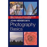
The majority of the photography part of the curriculum came from two fantastic books, John Hedgecoe: The New Manual of Photography: A Definitive Guide to Photography in Every Format, and his more basic one, John Hedgecoe's Photography Basics. I recommend both, because you can use a lot of the chapters from his Basics directly in the classroom. The Definitive Guide takes more careful thought about what is too advanced or non-essential for your students. I remembered him from college. I loved his book on filmmaking. He writes so beautifully and from the perspective of an artist, not a tech geek. And, they are visually exciting books, as well.

Here are just a partial list of sub topics in his chapter called, "The Art of Good Photography Composition" (Definitive Guide): The selective eye; placing the subject in the frame; using diagonals; circles; frames within frames; selecting a viewpoint; linear perspective; using shadows; texture, pattern, and quite a few more. He has another complete chapter devoted solely to color.

So, if, like me, it's been a long time since you took that photography class, consider these two books. There are many others that cover more specific or advanced photography topics, but these are the best essentials for the art of photography.

Wednesday, March 26, 2008

New Assignment Got You Scared?

This is the time of year when a lot of art educators, especially in public high schools, are told, "You will be teaching __________ (fill in something you know diddly-squat about)." That's the nature of our job. If parents only knew how unprepared we sometimes are. If you are visiting this blog because you were just told to teach Computer Graphics or Digital Photography or some other form of creative visual communication on the computer for which you have little experience, relax: there is help, very affordable help, with a friendly name: lynda.com. This site has very detailed video tutorials on just about any software you will need to know, as well as great basic information about.

For example, they have about 120 hours of Photoshop CS3 tutorials, broken up into manageable chapters. But they also have 5 hours of Digital Photography principles, from history of photography to composition. They cover about 200 products from Illustrator to Flash to 3D Studio Max to Dreamweaver, even basics like Word, all up to date.

Lynda.com is designed to be very comforting and easy to follow. The individuals who teach each topic are the type of person you'd like to take out to dinner. Nice, friendly folks.

But, here's the beauty of it. This incredible video collection is only about $25/month with no long-term commitment. That means if you only have July to get your act together, you pay $25 and you can spend 10 hours a day with it if you want. You play only the videos you need, you replay them if you need to. Easy.

My husband (an animator and multi-media wizard) and I use it frequently. I have recommended it to several teachers who couldn't afford a local college class (or wanted to move faster than the local class) and they have loved it as much as we do.

So go meet Lynda and relax.

Adobe School Innovation Competition-May 12

From their website:

"With the theme My Community — My Planet — My 21st Century, high school students in grades 9–12 (ages 14–19) can submit entries in three categories: Web Design and Development, Film and Video, and Graphic and Print Design. Category award winners as well as one grand prize winner for best overall submission will be chosen.

Submitted projects, dealing with students' community, the world around them, and their own future, should showcase the most creative and innovative use of technology using Adobe products. The deadline for submissions is May 12, 2008. Winners will be announced at NECC in San Antonio, Texas."


Thursday, March 20, 2008

Now for Something Completely Different


You've graduated from Etch-A-Sketch to Photoshop, but have you tried this yet?

Friday, March 7, 2008

Sequential Art Project


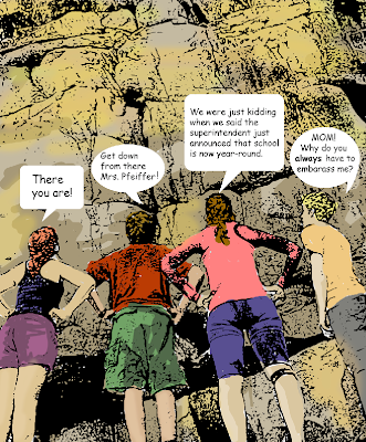
My digital photography students have enjoyed a sequential art project where they turned a story idea into photos, the photos into comic-book style art and then created a few pages of a comic book. Above is an example of a frame I did. The steps are pretty easy:

1. Open a photo in Photoshop and adjust it in Image>Adjustment>Levels so that you have no more than about 15% as shadow areas, paying particular attention to reducing dark shadows in key areas, like faces. (Unless you are going for the dark, mysterious, detective style of comic art).
2. Unlock the background layer.
3. Filter>Sketch>Stamp (make sure the default colors are black and white).
4. Select>Color Range. Choose the white. Then hit delete to make all the white areas transparent.
5. Make a new layer UNDER the stamp layer.
6. Paint on the bottom layer, so that the color shows under the black and transparent stamp image.
7. Add your talk bubbles on separate layers so you can move, flip or scale them. (Talk Bubbles are hiding in the library menu for freeform shapes: choose the shape tool, in the top toolbar choose the freeform shape, choose the arrow at the top for the library of more shapes you can add, find TalkBubbles). Type your dialog using a comic-book style font.

(Some students experimented with other filters to create a slightly different illustration style.)

My students started with a story board sketch. After the above steps they placed them on a new page and added black boxes behind each frame (to look like black borders) and made a title frame.

This idea has so much potential. It's a way to add story-telling into your curriculum. The original idea actually came from an English teacher at my school who had attended a workshop on incorporating sequential art making as a form of storytelling.

Comic Life is a sequential art-making software that has layout templates, style filters, comic-style fonts, i.e. short cut software perfect for this project. This software came free with iMacs for awhile (not sure about this year's iMacs), but is very inexpensive to purchase: http://plasq.com/comiclife So, if you are collaborating with an English teacher who doesn't know much about Photoshop, Comic Life may be the perfect answer.

My lesson plan for this project (using In Design for the layout, but you could use Photoshop for the layout just as easily) along with other projects in on my Teachers Pay Teachers site.

Picking Dawn's Brain

Dawn Pederson keeps a blog called "Dawn's Brain", but its her class website that is the gold mine. She has given me permission to share these with you and I did mention it in an earlier blog. But, I just want to mention it again. She has wonderful lessons for graphic design teachers, for example: "You're the Movie: Poster Project", "Layout Game" (I'm stealing this one, Dawn), "Color Theory Mandala", "Color Emotions Poster", "Text as Image". Check it out.

Thursday, March 6, 2008

How do Ideas become Images?

Telling Stories to Trees, watercolor illustration by Rima Staines

A Button House for a Button Mouse, illustration by Rima Staines

I love to read the blog of illustrator Rima Staines. Her writings remind me of how art comes from ideas and ideas from art. Art that inspires us to spend time with it for awhile is rich with ideas.

As she writes in her profile on her etsy shop: "Rima's curiosity leads her through the many worlds of words, languages and lettering, books and stories, puppetry, nature and interesting people, music, superstitions, folklore and fairytales, and most of all the otherness that can be found on the periphery of our lives, the strange and grotesque, the absurd and unnerving ... that topsy turvy in between place where things are not quite what they seem...Rima paints and draws on wood and paper. She enjoys entwining script and image closely and loves to write rhyming stories to tell her characters' tales using forgotten words and other languages."

Her illustrations and the work of other illustrators that she writes about evoke a whole story just in the one sample illustration. They are a glimpse into a vast magical world that we get an invitation to once in while. It reminds me of that game my son plays on the internet that he'll never get to the end of because the game designers keep adding more "worlds". We never get to the end of ideas and stories, so we'll never run out of the magic world of illustrations.

With digital media, our students don't really tap into the magic until after they've gotten a good handle on the technology. But once they do, it is very exciting. I plan on posting regular "When Magic Happens" examples of students and include their description of where their idea came from (if they can articulate it).

Until then, I hope you spend some time with Rima's blog. I think it will give you lots of ideas.

Monday, February 18, 2008

Solarizing Digital Photos


This is one of the easiest projects to do. I throw it in between a couple very difficult projects to give my students a breather. There always a few that say, "Of all the projects we've done this one is my favorite!" And then I think something like, "But, I put a lot more work into some of the other projects." You could also do it near the beginning of the year, but you might be glad to have something easy and fun to do in the middle of the winter blahs.

These examples were done by two of my students. I included two versions of the eye so you can see the differences determined by what blending mode you choose. The top eye photo started with normal, natural colors, but this process shifted the colors and added interesting textures in the shadow areas.

Its so easy I can tell you how to do it right here:
1. Choose a well-composed color digital photo and open it in Photoshop.
2. Copy the layer and name the top layer "Solarize" (On the Layers palette, drag your layer over the little icon to the left of the little trash can.)
3. Filter>Stylize>Solarize (make sure the fill and opacity are at 100%)
4. Image>Adjustments>Hue/Saturation and play with the sliders to get interesting effects.
5. Now play with the Blending Mode choices (on the Layers palette) to blend the two layers together in interesting ways. It's ok if you think "normal" is actually the best one.

Have your students do it to two different photos so that they remember the steps.

If you were not at my workshop and would like the handout with all the visuals (example and screenshots), email me.

Wednesday, February 13, 2008

Doodle 4 Google


Have you heard about Google's K-12 student art competition? Here's my favorite part: "The National Winner will win a $10,000 college scholarship to be used at the school of their choice, a trip to the Googleplex, a laptop computer, and a t-shirt printed with their doodle. We'll also award the winner's school a $25,000 grant towards the establishment/improvement of a computer lab."

More Creative Advertising


Thanks, Suzanne, for sending us this link.

Tuesday, January 22, 2008

Good Examples for Video Projects

It's frustrating to start a video editing project and search YouTube for well-done, creative examples that don't have sex, drugs, violence, nudity or foul language. I recently spent many hours during weekends and snowdays trying to find some. I'll share them with you and would love for you to share your favorites for the classroom as well.

For storytelling style: "Silent Beats", http://youtube.com/watch?v=76BboyrEl48
This wonderful video not only shows us how easily it is to lean on stereotypes, but it is so easy to teach creative camera work, editing and visual storytelling with it. It has no dialog, but we get what it is trying to tell us. When you show it a second time, explaining why the camera is here, why the editor did this, etc. you find even more clues to the story. It is so clear and well-done. It is also a wonderful example for character education.

Stop motion is always fun. Here are some of my favorites, although the first one has a mild violence in it:
"Tony vs. Paul", http://youtube.com/watch?v=AJzU3NjDikY
This one is all about drawing: "Minilogue/hitchhikers choice", http://youtube.com/watch?v=u46eaeAfeqw
"Retro Games in Stop Motion", http://youtube.com/watch?v=nhbt9z4fkWo
"Erbert & Gerbert's: Human Flipbook", http://youtube.com/watch?v=HClNcAvD1AY
and to go with it, the making of it: http://youtube.com/watch?v=AulVwjcnJhI&feature=related

Documenting a performance or other interesting event:
"Parkour Generations:City Gents": http://youtube.com/watch?v=SmVsa1SFgfU
(Notice all the interesting camera angles.)

Sunday, January 6, 2008

Not Cheesy

Last week, one of my students was looking through one of the many Photoshop wow-'em books I have in the classroom. We have actually done some of the projects. The student said, "You know Mrs. Pfeiffer, a lot of these examples are really cheesy. They actually aren't very good." She wasn't trying to make herself look superior, she was just giving me her honest opinion. I wanted to say, "Yea, sometimes I think you don't need much actual art training to publish a book on making art on the computer, these days." But, I just said something like, "Yea, I bet you can do better than him..."

So, today I went into Barnes and Noble and just as I was about to give up finding a truly inspiring book, I found this: Creative Photoshop: Digital Illustration and Art Techniques, by Derek Lea. I would say as a whole, it is for advanced students who have taken 2D art classes as well, but you can teach parts of his involved projects to beginners. I find it very inspiring and I suspect it is very appealing to hip young visual culturally literate teens and college students. My 14-year-old has already spied it and said "OH COOL!" and is actually sitting down and really studying it. I haven't shown it to my 20-year-old who is majoring in Communications Design in college. I think he'll say the same thing...or maybe "Awesome". Three-quarters of the book is more appropriate for a computer graphics, or advanced 2D class than for digital photography, because it is mostly illustration, but some of it does involve photography.

Derek Lea is a popular illustrator, not just a computer nerd who likes Photoshop, so this is real eye candy. Here's a link to the book in the Amazon-run bookstore I arranged for us: